The effects of the coronavirus pandemic happened in the way most bad things happen in life: slowly and then quickly.
One minute you were planning for new features and campaigns, and looking forward to Click Summit in May and all good things that happen when the weather gets warmer. The next minute you’re being asked to abandon any and all of your carefully-planned testing activities and instead launch your company’s COVID-19 response: standing up new landing pages on the fly, making big changes to your homepage, and using your testing tool in ways it’s not intended to be used.
We’ve heard from many website owners and testing leads how the emergence of COVID-19 had them scrambling to update their websites.
While it’s unclear whether these updates were derived from careful user research and testing, or the result of simply “we-need-to-get-something-up-now-and-this-feels-the-most-right,” we wanted to take a minute to acknowledge the quick work and smart thinking that went into these homepage updates and provide inspiration for others who are still struggling to determine the best way to respond, digitally.
Whole Foods
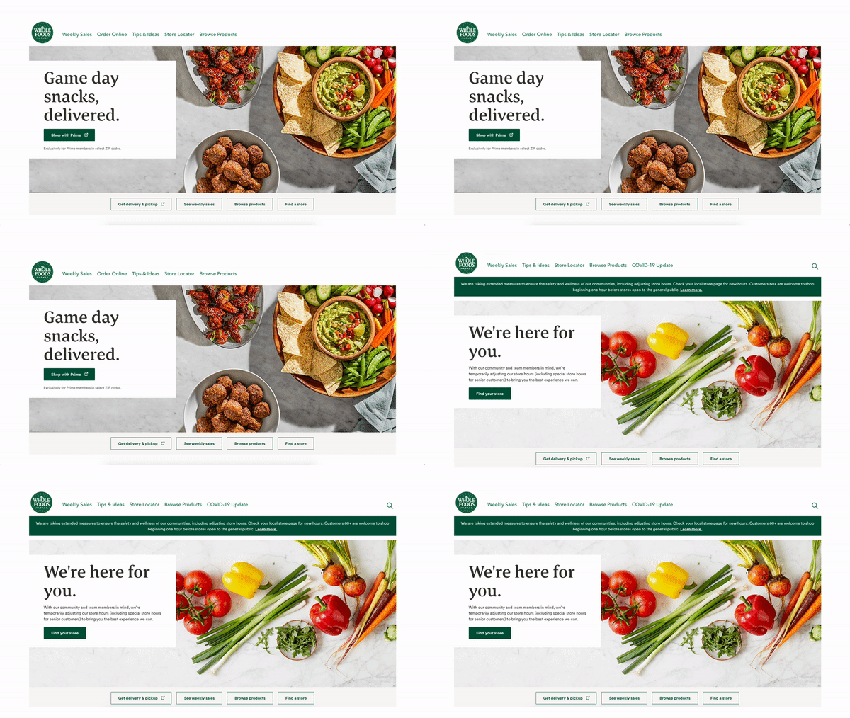
On February 1, Whole Foods’ homepage featured a gameday-themed message and imagery, in time with the Super Bowl. In response to the COVID-19 outbreak, Whole Foods’ website team changed up quite a few things, including:
- Swapped imagery from prepared foods to simple ingredients
- Added “we’re here for you” messaging
- Changed homepage CTA from “Shop with Prime” to “Find your store.”
- Added a homepage banner encouraging visitors to explore the measures they’re taking to ensure shopper safety
- Traded “Order Online” and “Store Locator” from the main navigation and added “Browse Products” and “COVID-19 Update” instead
Hyundai
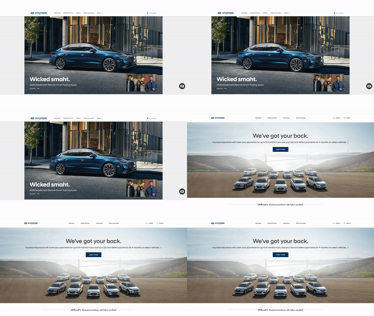
Remember Hyundai’s “Smaht Pahk” commercial? That seems like it was a million years ago. Looking back at their homepage on February 1, their team was still promoting the new ad campaign, which had launched just a few days earlier.
Fast forward to today: In response to the economic fallout of COVID-19, Hyundai announced a campaign offering financial relief to customers who need to purchase a car during this time, had recently purchased a car, and Hyundai owners who lose their jobs or experience a medical-related hardship due to COVID-19.
Their homepage was updated with new imagery and language promoting community with a new “Learn More” CTA that points users to landing page outlining these new services.
It’s worth pointing out that since March 30, they’ve also begun promoting their online purchasing experience called “Click to Buy” and are now featuring that on their homepage.
Recommended Read: Hide, Panic or Freeze: What Science Says About Consumer Behavior During A Crisis
Starbucks
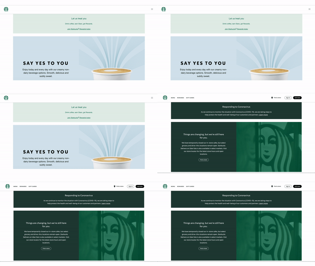
In January, Starbucks was promoting its Starbucks rewards program, as well as its selection of non-dairy beverage options.
By March 30, they had abandoned any product-specific messaging and launched a more brand-centric experience, adding a homepage banner encouraging visitors to navigate to a page outlining their new safety measures, changing the homepage imagery and messaging from “Say yes to you” to “Things are changing, but we’re still here for you.”
Zoom
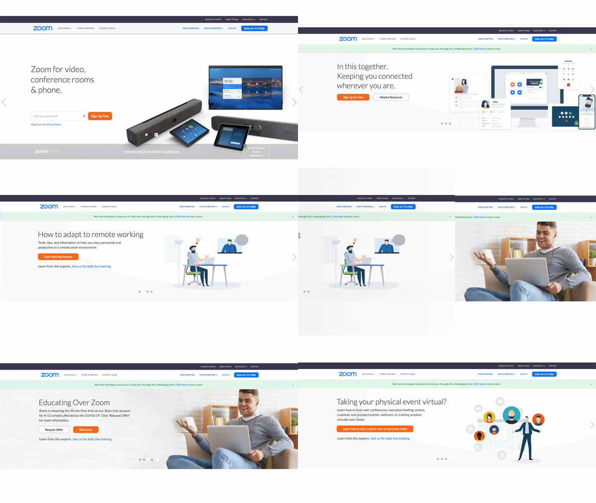
Earlier this year, Zoom was touting its hardware and software products on its homepage. Today, after posting a 200 million increase in users during the month of March, their message is a bit different. Here’s how their homepage has changed in response to the COVID-19 outbreak:
- Added mint-colored homepage banner encouraging visitors to explore their new remote work resources
- Changed main homepage message from “Zoom for video, conference rooms & phone.” to “In this together. Keeping you connected wherever you are.”
- Added additional carousel content for educators, event planners and employees that are new to working from home.
- Removed “Sign up free” form field
- Added secondary CTA “Helpful Resources”
- Swapped homepage imagery from product-focused to user-focused
Slack
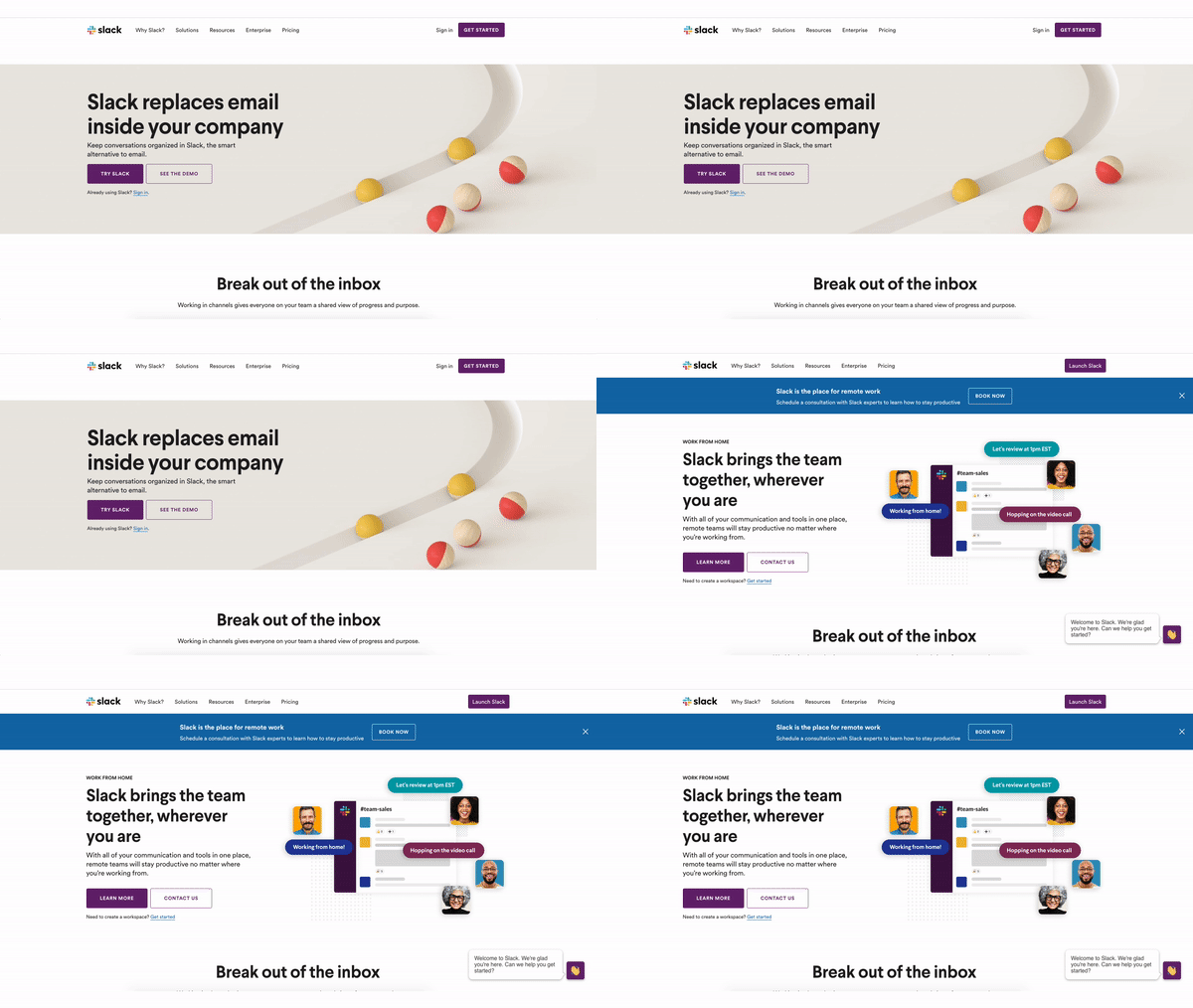
Slack, like Zoom, also saw unprecedented growth in users through March. Slack’s CEO, Stewart Butterfield, took to Twitter a few weeks back to share how the company has changed in the wake of COVID-19. (Read the full thread here.)
On March 16, the company reported 10 million simultaneously connected users on the platform. By March 25 that number had grown to 12.5 million.
Slack’s changed their homepage messaging from a message that focused on its ability to replace emails to one that touted the platform’s ability to connect teams now having to work remotely.
They also changed the homepage CTAs from “Try Slack” and “See the Demo” to “Learn more” and “Contact Us.” Finally, they used added a new, blue homepage banner to promote a new consulting service for teams looking to get started with remote work.
Crocs
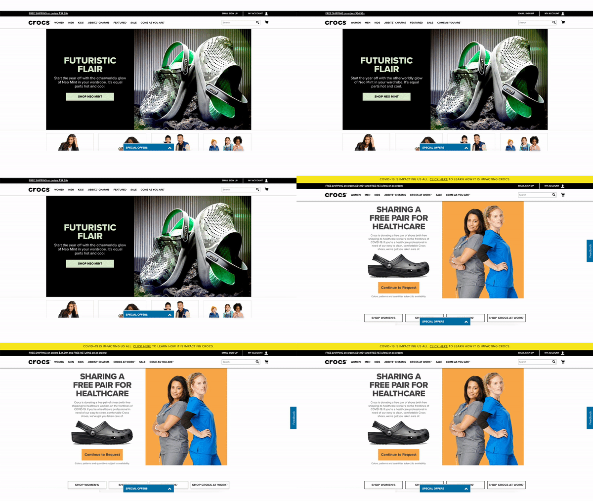
Earlier this year, Crocs was promoting it’s “Neo Mint” product line on their homepage. In response to COVID-19, Crocs launched a campaign offering free crocs to healthcare workers, who likely make up a large portion of their customer base. Here’s how their homepage has changed today:
- Added yellow banner navigating users to a COVID-19 landing page where they outline the changes to their stores, and their new healthcare-targeted campaign.
- Changed imagery from product-focused to campaign-focused imagery
- Changed CTA from “Shop Neo Mint” to “Continue to Request”
Home Depot
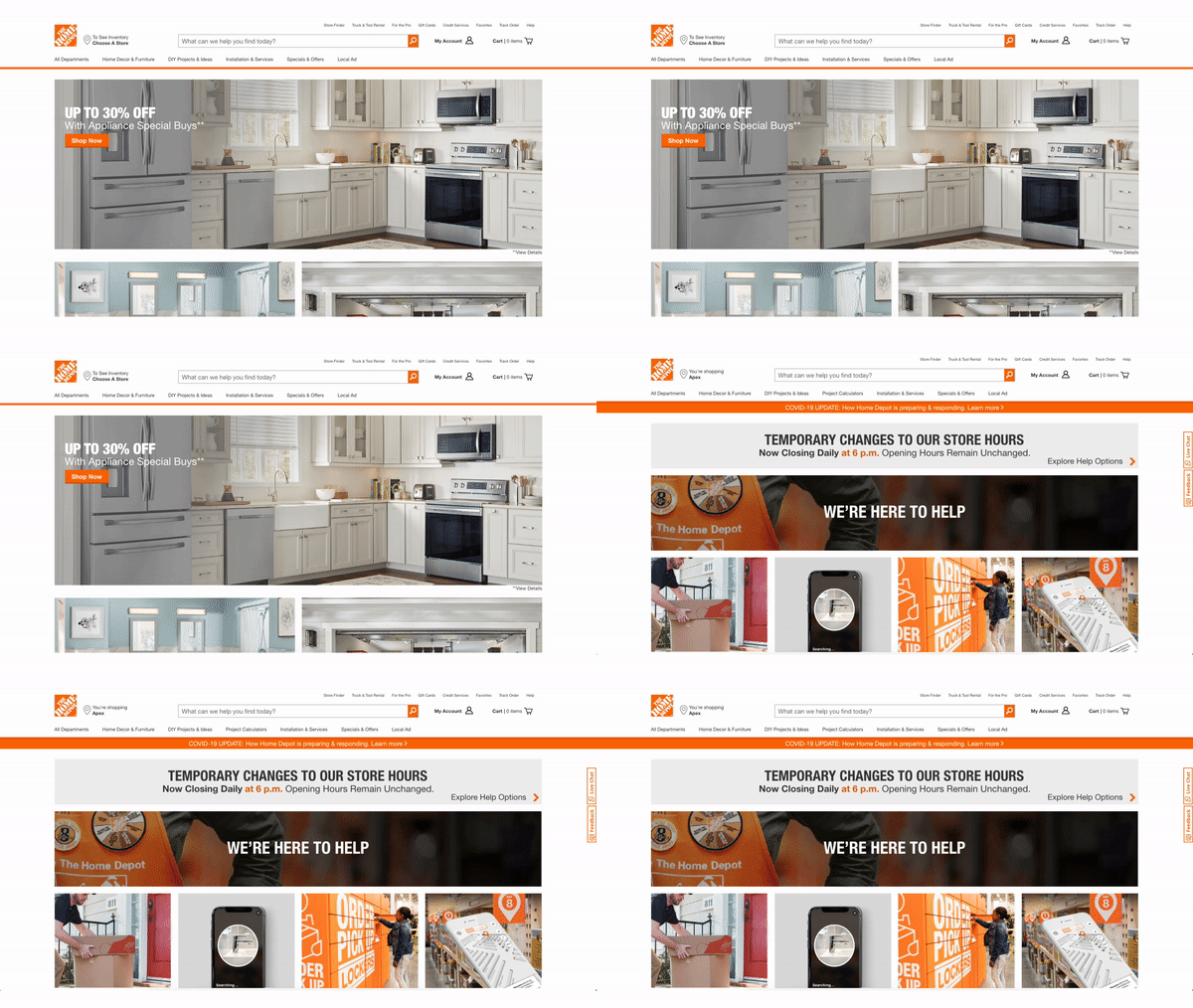
On February 1, Home Depot’s homepage was dedicated to its sale on appliances and vanities. As of today, it looks much different. Here’s how their homepage has changed:
- New orange banner navigating users to the company’s COVID-19 response page
- New gray banner describing temporary store hours
- Added “We’re here to help” messaging
- Promotes options for shopping while social distancing including free delivery, search by image or voice, free in-store pickup, and “see what’s in stock and find it fast”
- Also now promotes digital workshops
Delta
Whereas some companies were seeing a sharp increase demand for their products and services, some companies, including many in the travel space, are not.
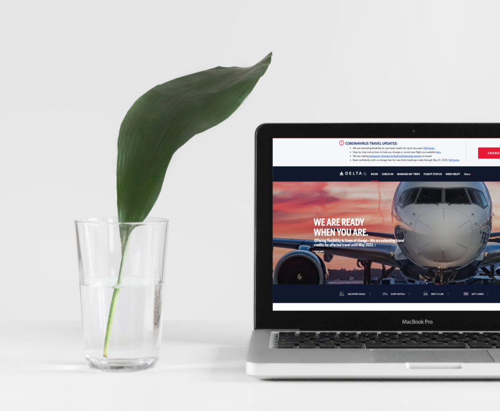
Akhil Anumolu, Delta’s GM of Digital Experience, recently posted on LinkedIn reflecting on his team’s work to update their homepage hero, saying, “In my ~5 years at Delta Airlines, this homepage hero and flexibility for travel credit we developed for our amazing passengers has become the top highlight of my tenure.”
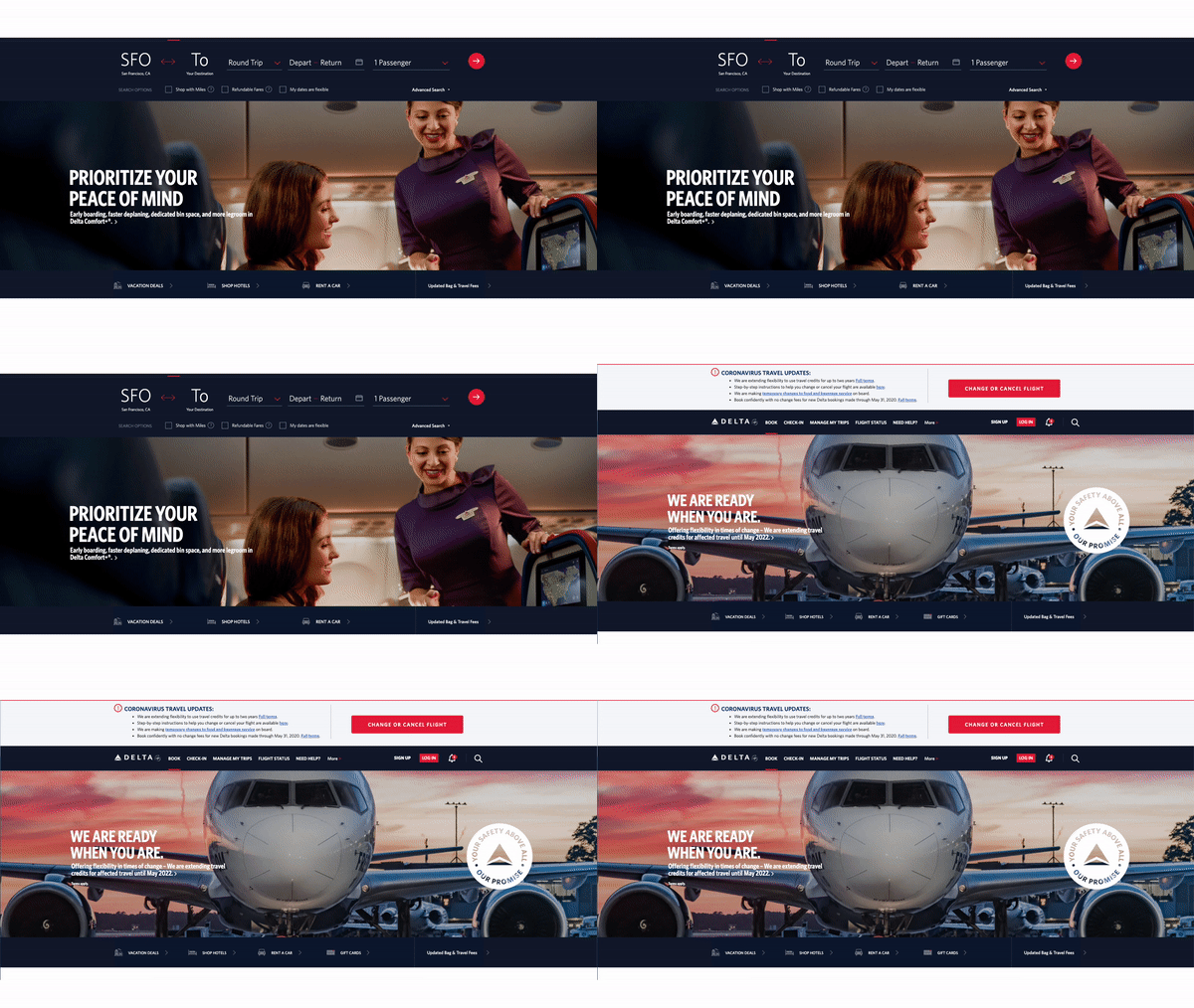
Delta’s new hero trades in messaging that promotes a faster and more efficient travel experience and instead elevates its new, extended travel credit policy. It also swaps its homepage flight booking module for a banner outlining Coronavirus-related travel updates and offers a clear, call-to-action for customers looking to change or cancel their flight.
Well done, Delta.
When you’re working quickly, managing moving goalposts and being asked to plan for a future that feels uncertain, it’s important to take a breath and look back at what you’ve accomplished in the last couple of weeks. Of course, these are just a few of many great examples out there.
As this situation continues to evolve, we look forward to monitoring more innovative ways companies are adapting and responding to their customers during this pandemic, and tracking the associated changes to their digital experience.


