
The Challenge
Increase hotel bookings among visitors to the IHG homepage.
Our Process
Through analyzing IHG’s quantitative data and conducting additional qualitative UX research, we found the number of tabs and options available distracted visitors from their core purpose of researching hotels. From this research, a hypothesis emerged: IHG needed to simplify. By eliminating points of friction within the homepage booking module, IHG would then increase booking conversions.
The Experiment
The homepage test took approximately two weeks to plan and design, with an additional ten days for development and QA. The experiment ran for two weeks, testing two different challengers against IHG’s control experience.
The Control

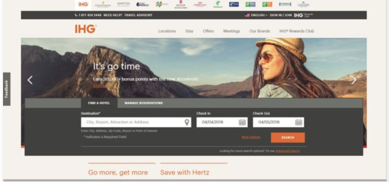
IHG’s homepage search module is made up of a combination of tabs and fields. Using the tabs along the top, users could find a hotel or manage an existing reservation. Under the “find a hotel” option, after inputting values into the destination, check-in date and check out date fields, the module expands to reveal six additional fields, as well as a link to an advanced search page.
Challenger 1
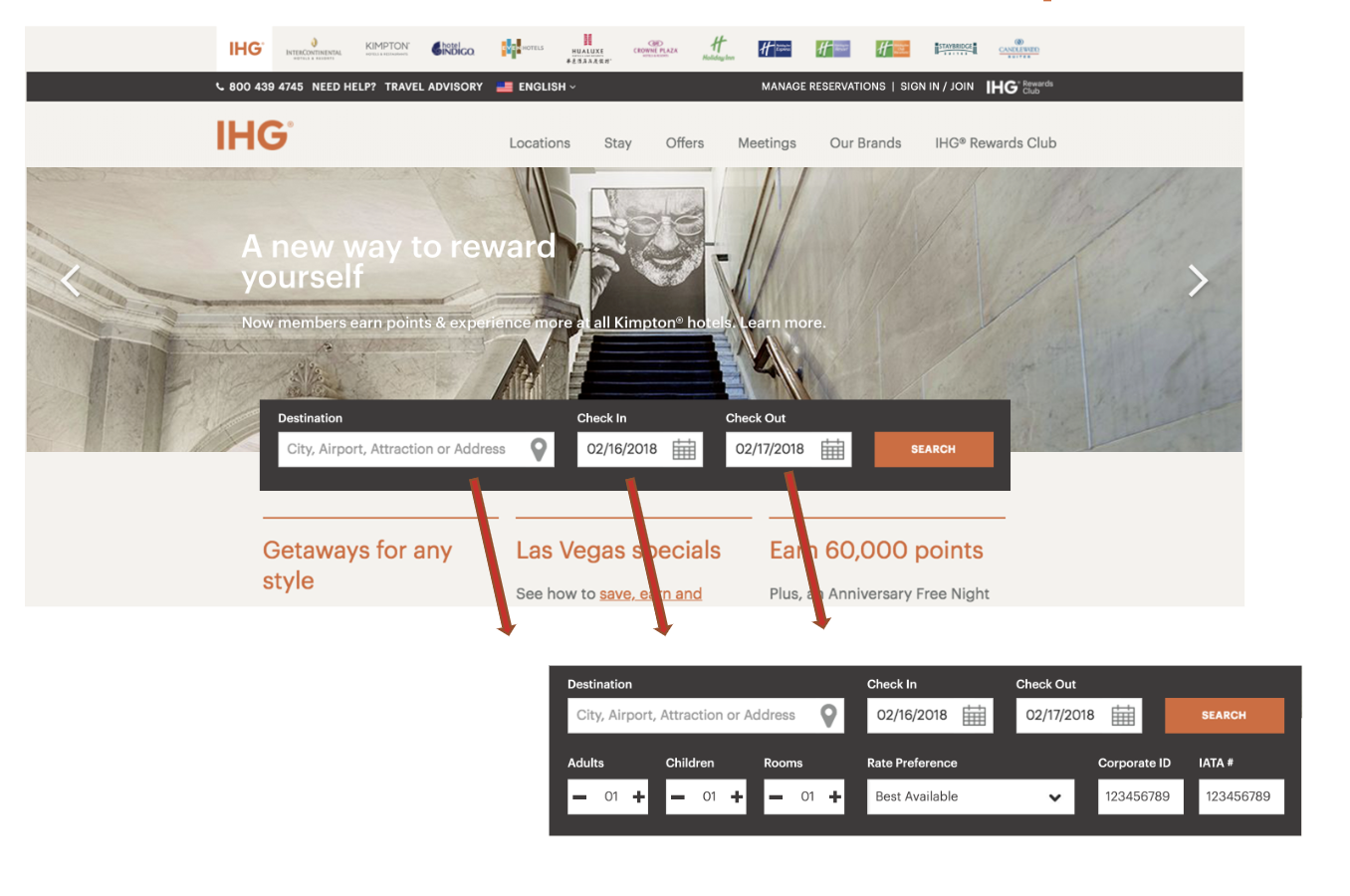
We eliminated the tabs, the auto-expand functionality for secondary fields and the ability to do an advanced search. The manage reservation task was moved to the “utilities” section of the header.
The idea behind this challenger was that by eliminating the distraction of the tabs, the auto-expand functionality for secondary fields and the advanced search, IHG users will search more often, leading to an increase in bookings.
Challenger 2

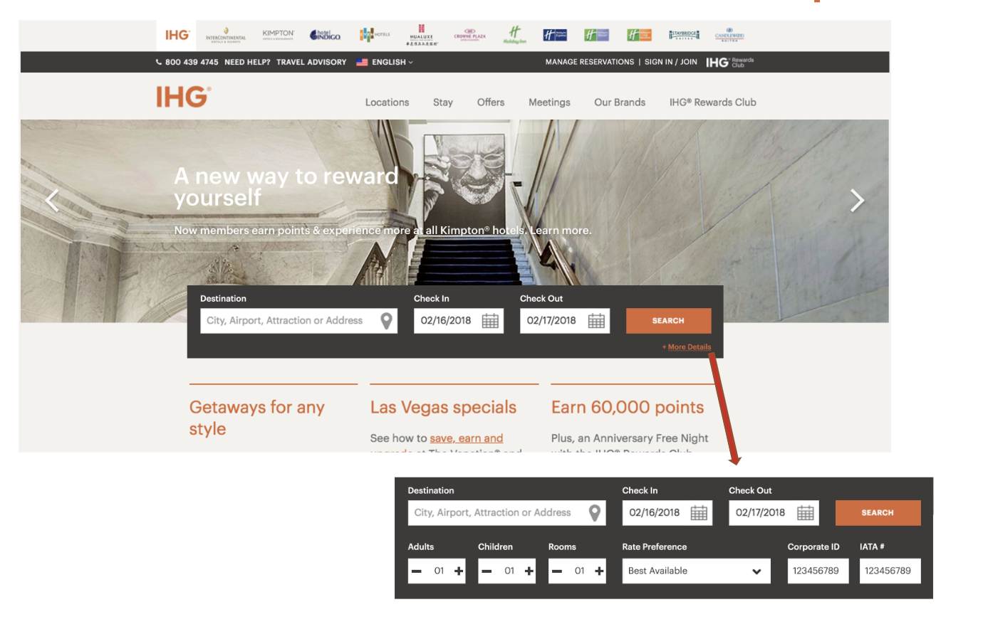
We kept the auto-expand functionality for secondary fields but eliminated the tabs and the advanced search option.
For this challenger, by keeping the auto-expand functionality, IHG allows users to see additional fields that they can apply to their search. This will cause users to search more often and more intentionally, leading to an increase in bookings.

